Ideation
Low Fidelity Wireframe
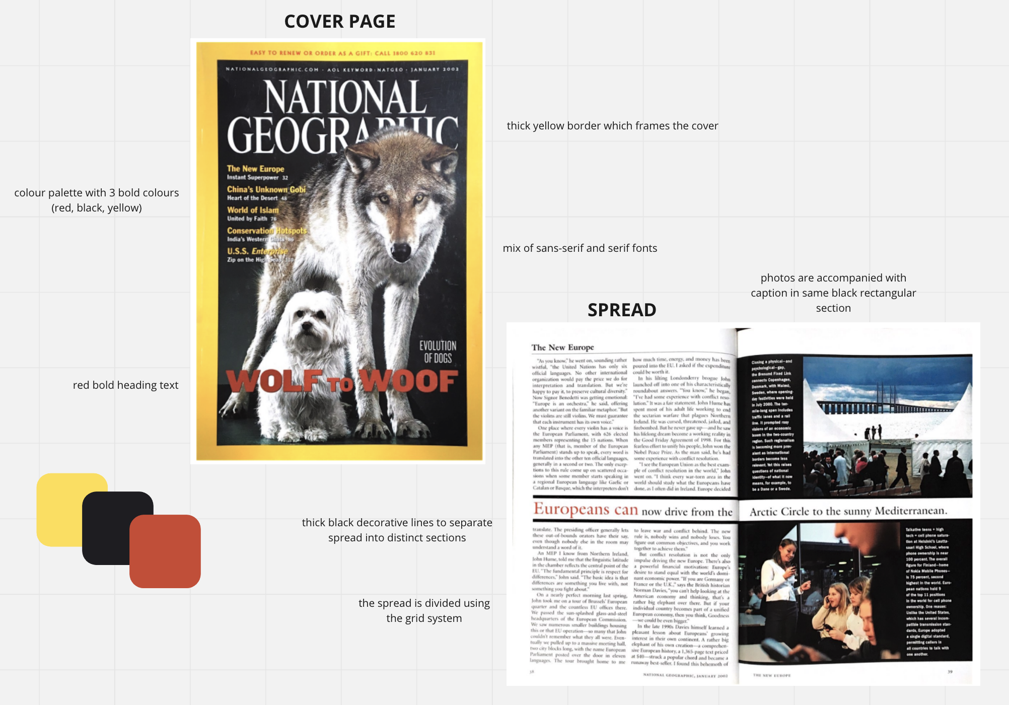
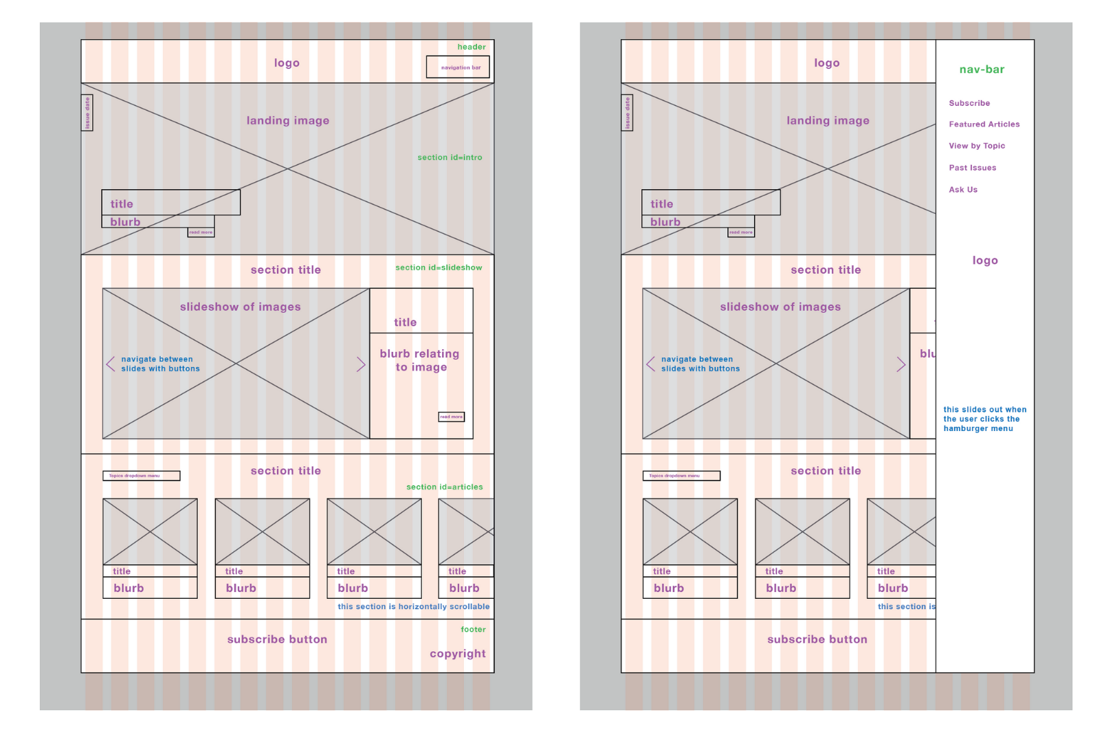
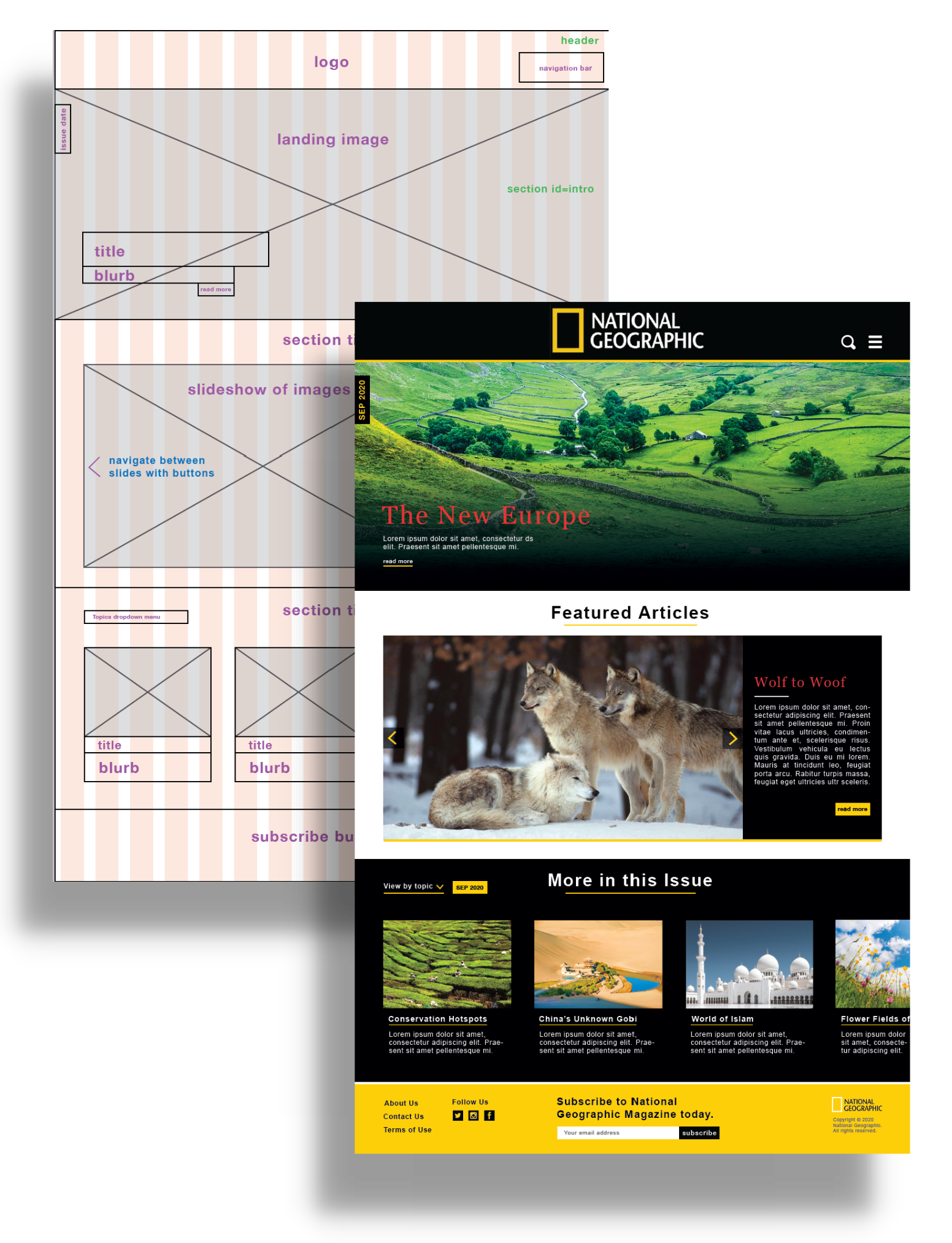
After definining the target user group, I proceeded into the ideation stage and constructed
a low fidelity wireframe upon a 12 column grid layout in Adobe Illustrator. Given National
Geographic’s strong visual focus on photographs, I made sure to incorporate a landing image
and a slideshow structurally reminiscent of the captioned photographs from the spread.
Furthermore, key website elements such as the header and footer housed child elements like
the search bar, hamburger menu, site map and copyright information.
One crucial element for all magazines is the option of subscribing. In this case, a phone
number for subscription services is presented in small red typography at the top of the
cover page. I initially positioned the subscribe option in the header in the first high
fidelity mockup.
High Fidelity Mock-up: First Iteration
Next, I built a high fidelity design mock-up upon the wireframe in Adobe Illustrator. I
incorporated the tri-colour palette throughout the design, utilising the bold red shade in
heading text and golden yellow shade to indicate affordance in the buttons and linked text.
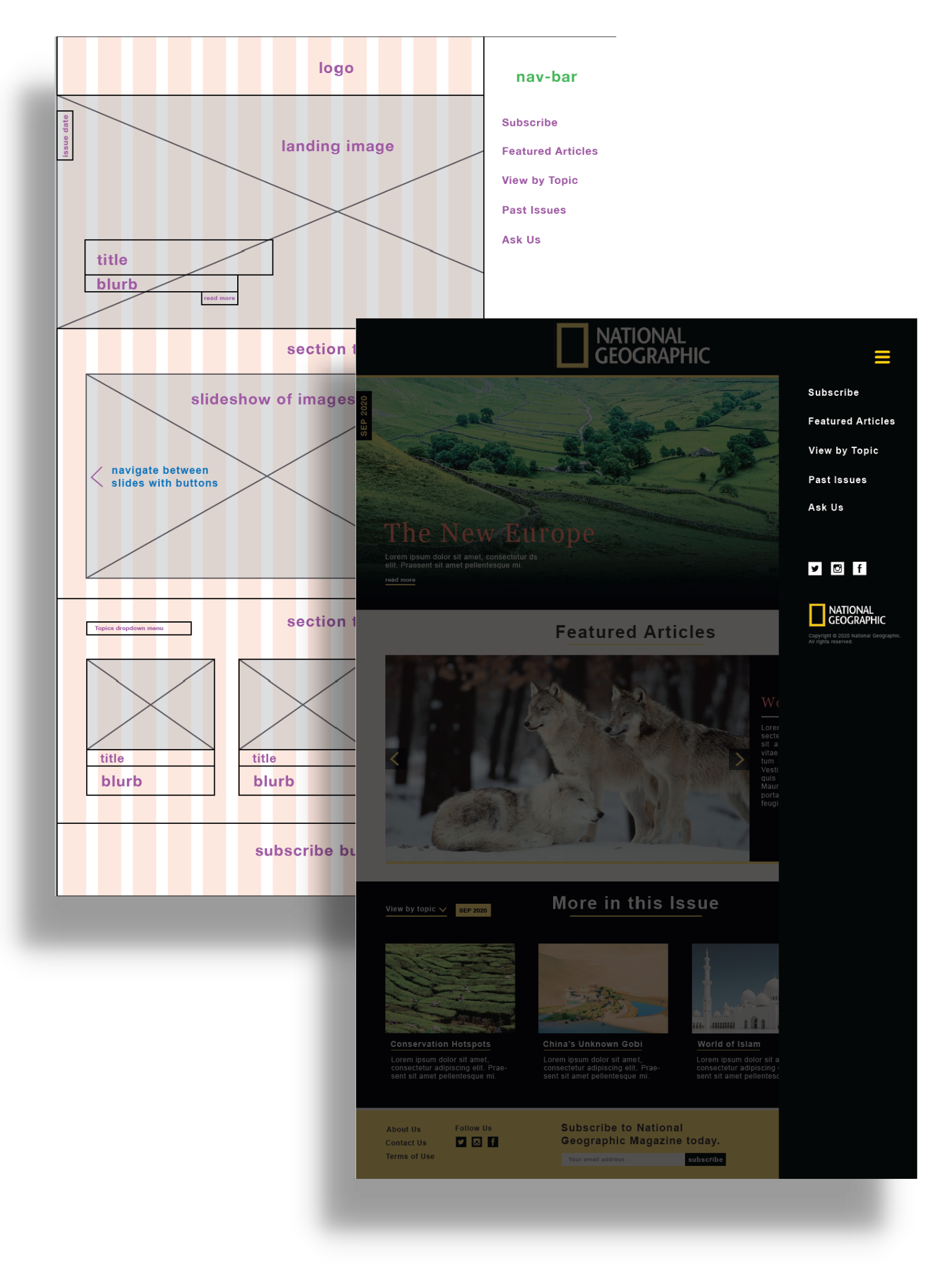
User Testing
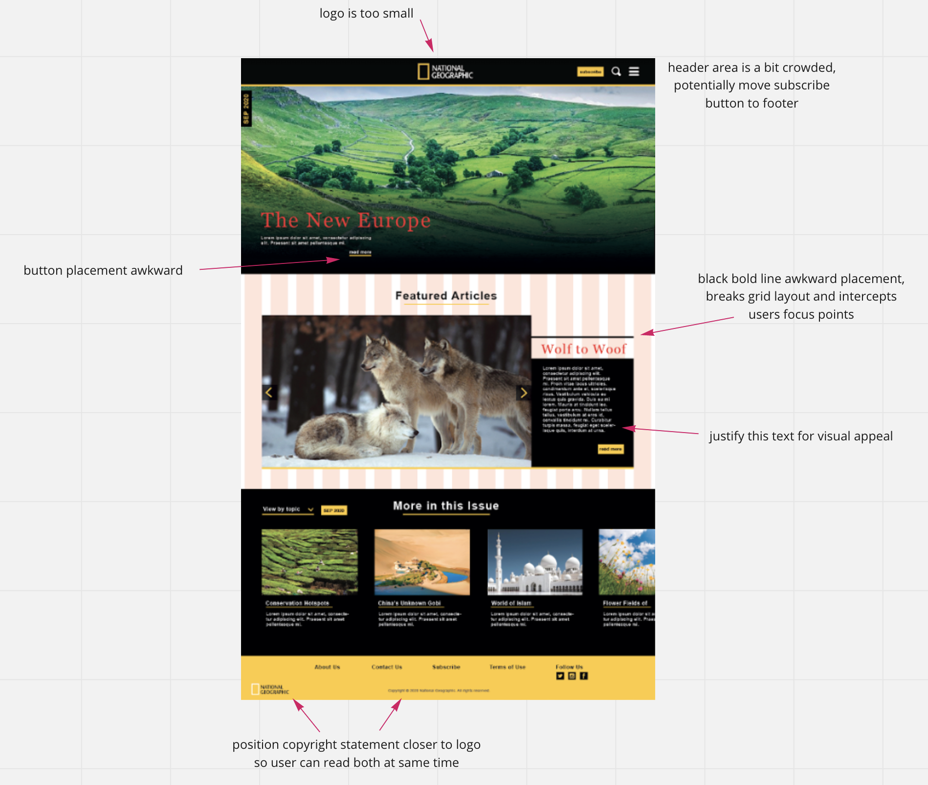
After presenting the first high fidelity mock-up to a few peers as well as the tutor, I
received generally positive feedback for the page architecture and use of colours. However,
further improvements could be made to the design such as changing the position of the
subscribe button to the footer so it is both accessible to the user at all times while not
being pushy.
High Fidelity Mock-up: Second Iteration
I incorporated feedback from user testing into the final mock-ups below. The main changes
were to the button positions in order to improve accessibility and alignment with other
elements, increasing overall visual appeal and coherence.
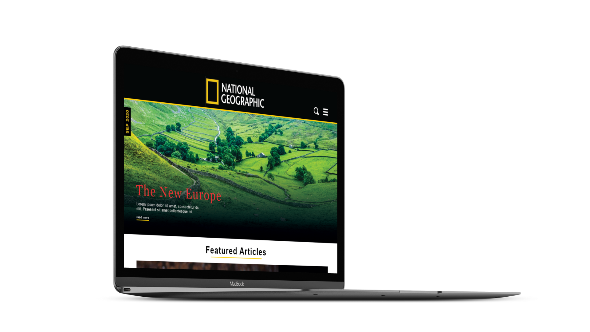
I then coded up my design using HTML, CSS and some vanilla JavaScript to provide mock
“opening” functionality for the side menu. While translating the design, I realised that the
font-sizes in the mock-up were too small so I increased them for web readability.
Furthermore, I added dynamic animations to adapt my mock-up for the web and increase
affordance of elements. These include the subtle fading in of the side-menu/search-bar and
expanding of the yellow underline on hover to indicate a clickable link. Buttons would also
darken on hover, and the search/menu buttons would toggle between being white and yellow
depending on their state.
Live Demo
View a live demo of the website 👉
here. Have a click around!
Note that the webpage has a white buffer on the right side. This is because it is
hardcoded to be 960px wide, as per the brief for this project.