User Activity 1: Users can curate a radio station to tune into.
User Journey
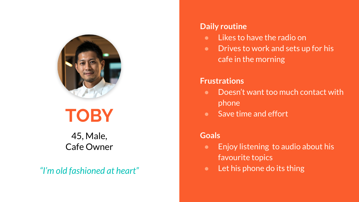
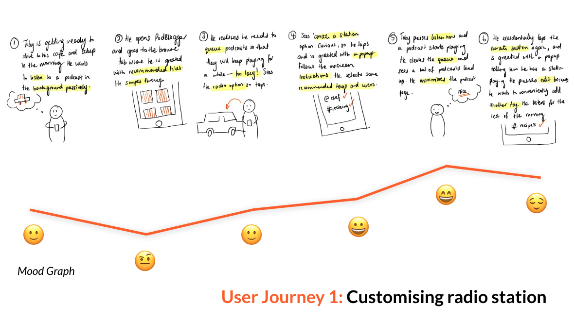
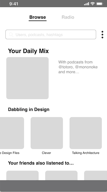
My first user journey centres around Toby and his daily routine of travelling to and setting
up for his cafe. After opening the PodBlogger app, he discovers the curate a radio feature
and follows through a series of screens to customise a radio station to his liking, by
entering hashtags and usernames into a search bar. After accidentally tapping the curate
button again, a pop-up appears to confirm his action.
I then defined the relevant key features to develop in Podblogger:
-
Algorithmic and curated feeds: The user is able to randomly
discover new content amongst podcasts by their favourite creators. Inspired by the
speculated TikTok discovery algorithm, this method of inserting new content amongst
popular content keeps the user comfortable and happy whilst introducing them to new
content which has potential. By tracking the engagement potential with newer content,
PodBlogger is able to create more accurate data regarding recommendations and similar
podcasts.
-
The algorithm uses a set of hashtags and users to generate
similar podcasts to supply the radio station. The queue of podcasts is automatically
filled up, so the user does not need to spend time manually searching and queueing
themselves.
-
Having a radio station is incredibly useful for situations where audio is the preferred
medium such as driving. This can also be easily integrated with
smart speakers and personal assistant interfaces, creating a
hands-free interface.
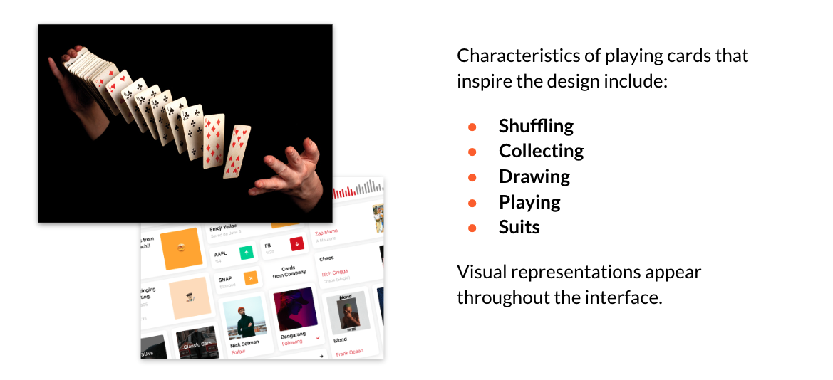
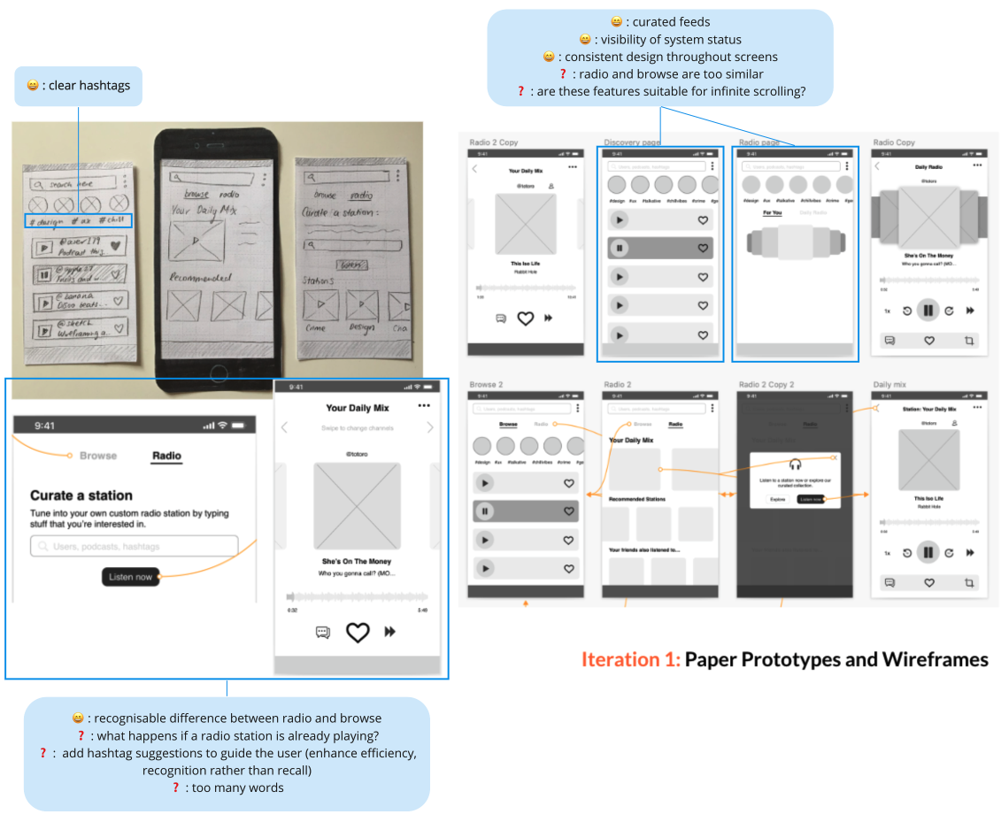
Iteration #1:
The radio feature is inspired by the act of shuffling cards as well as playing card suits
(curating a radio station based on 'suits' of interests, hashtags, topics in a shuffled
order). I started off with rough paper prototypes before transitioning into medium fidelity
prototypes in Sketch.
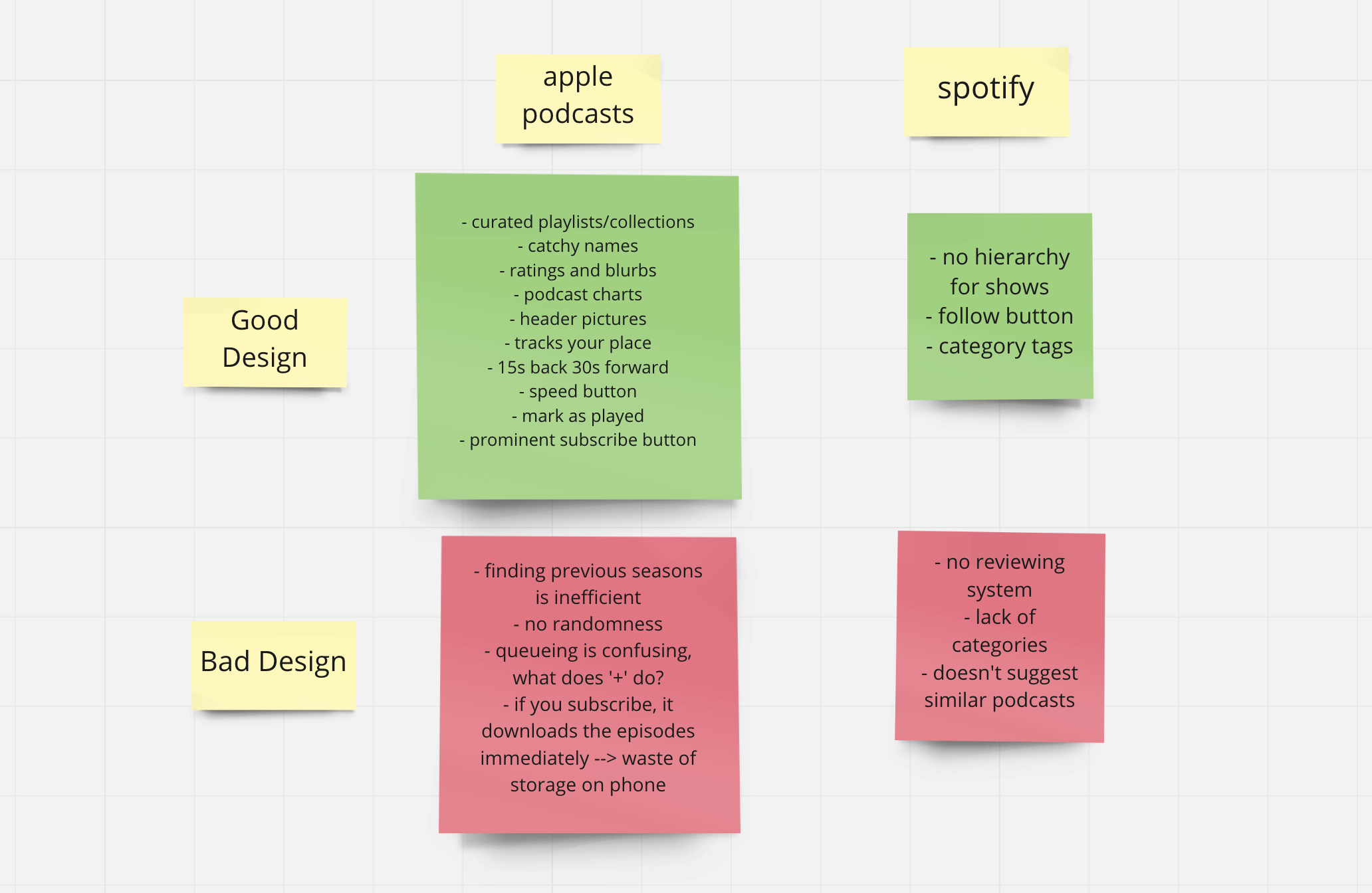
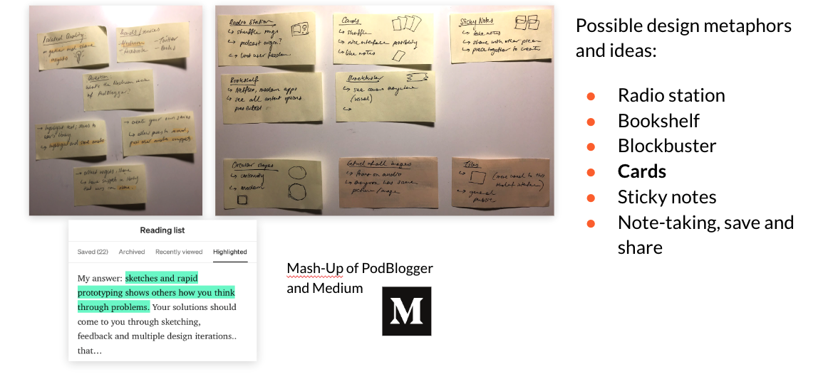
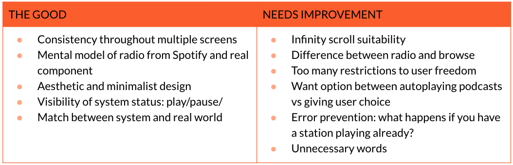
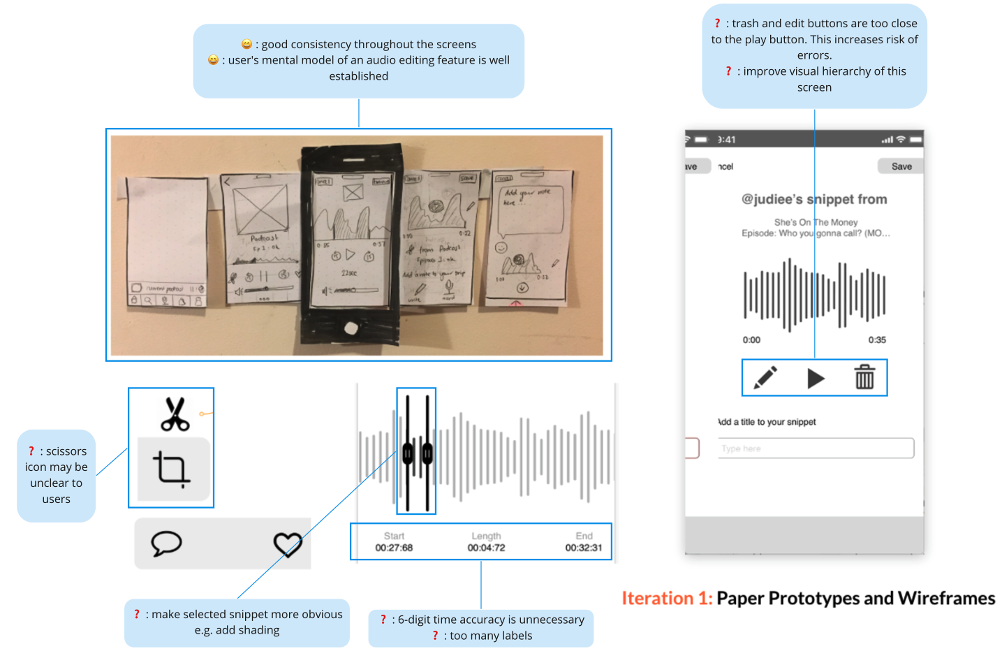
Usability Testing
Interface testing was done via the Wizard of Oz method with paper prototypes and sticky
notes to emulate popup windows and extra elements that would appear after button presses
etc. I highlighted positive and negative design aspects through callouts (as seen in the
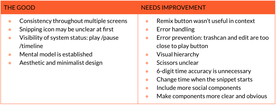
picture above) and summarised them in the table below.
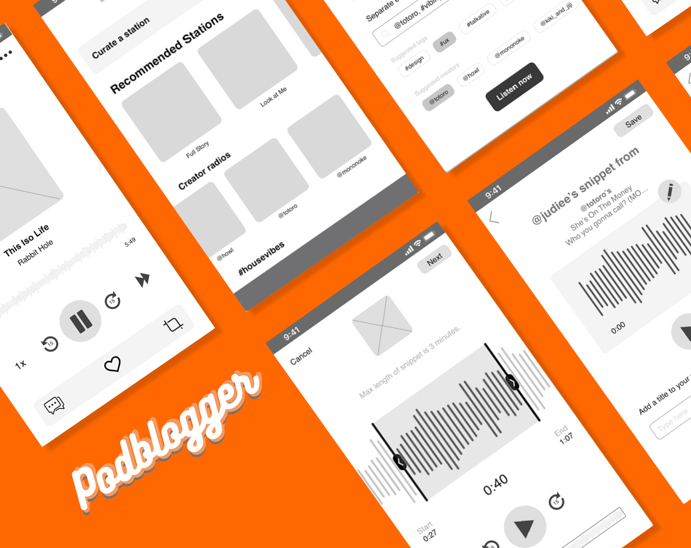
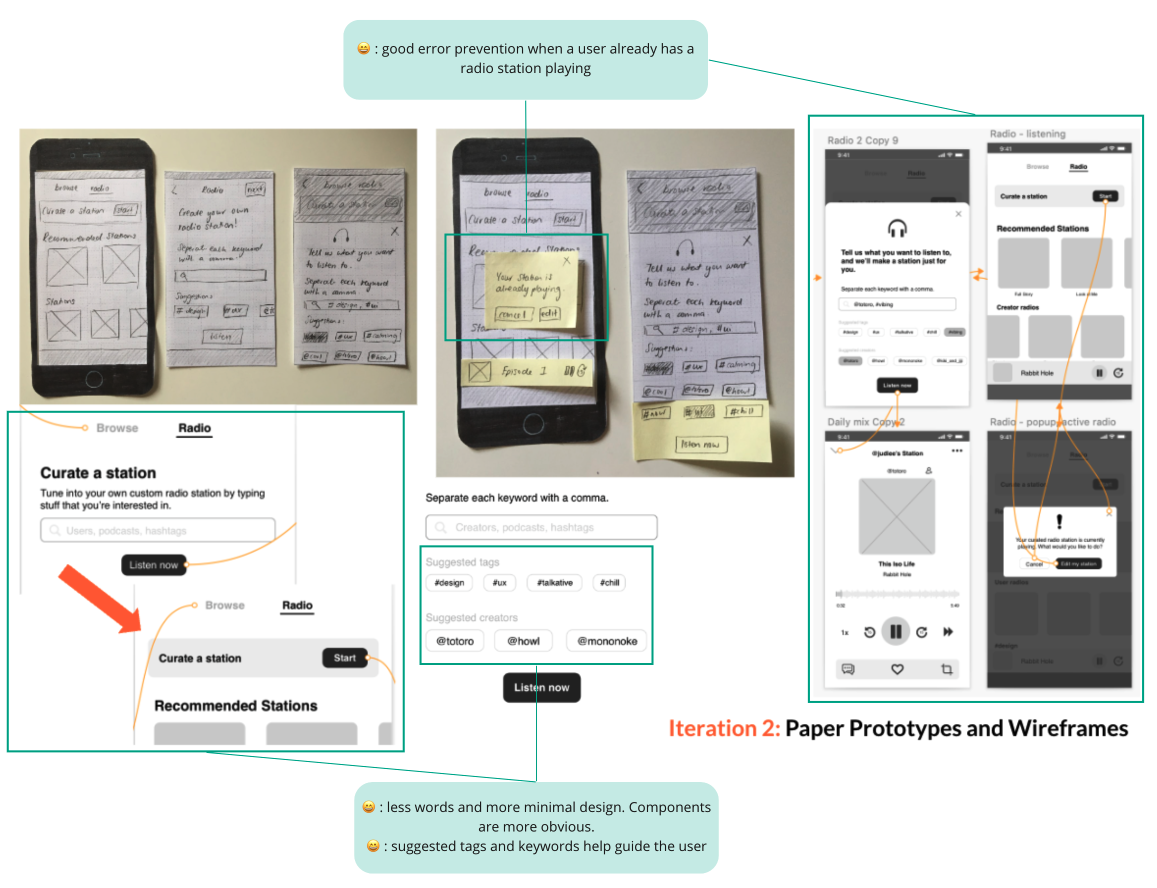
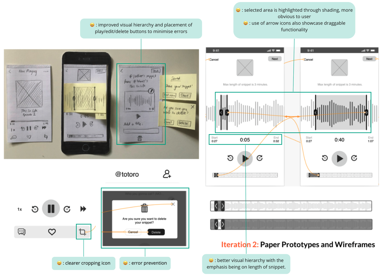
Iteration #2:
Areas of improvement discovered from user testing were worked on during this second
iteration. I've highlighted a few of them in the callouts in the picture below.
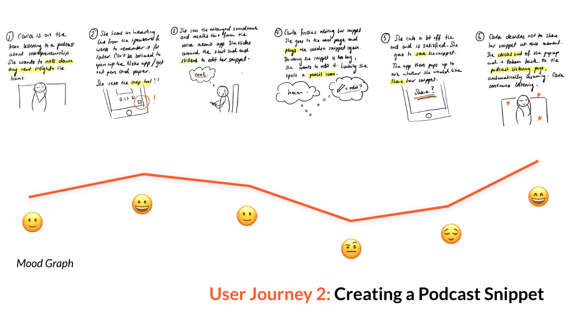
User Activity 2: Users can trim, save and share audio snippets from podcasts they are
listening to.
User Journey
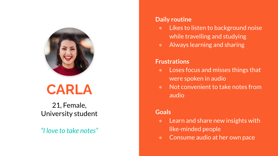
My second user journey follows Carla who’s listening to an entrepreneurship podcast on her
train journey. She hears a super interesting insight and wants to note it down, but doesn’t
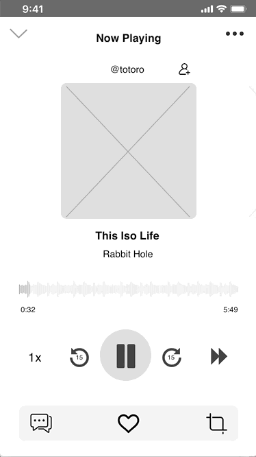
have pen and paper, and doesn’t want to switch apps. Using the cropping feature, she creates
a snippet of the podcast and saves it to her library to share later.
I then defined the relevant key features to develop in Podblogger:
-
Inspired by the highlighting function Medium where users can select portions of text in
articles and save it to their library, users can
crop audio snippets from another creator’s podcast. The
snippets include acknowledgements to their original creators to attribute creator’s to
their words and ideas. By creating its own
note-taking system, PodBlogger allows its users to stay on
its platform and engage even more with the app. User’s do not need to open another app
or grab pen and paper to note down interesting insights.
-
The functionality and interface of the snippet feature is quite simplistic because it is
aimed at the average user’s ability and intents: to quickly grab a snippet from a
podcast and save/share it rather than doing a very precise edit. I looked into the audio
editing GUI of Anchor, a podcast creation app which has kept it very minimal.
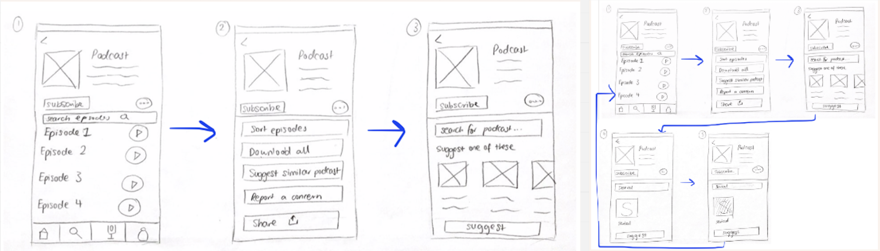
Iteration #1:
Similar to my process for the first user journey, I started off with rough paper prototypes
before transitioning into medium fidelity prototypes in Sketch. I also used Adobe
Illustrator to mock up the audio waves. Snippets will be visually represented as a card that
the user can store in their library and share.
Usability Testing
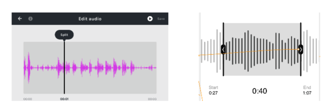
This activity was a bit harder to test because the trimming functionality was near
impossible to recreate on paper and digitally at this stage. However, I was able to test and
evaluate the existing audio trimming features in the Voice Memos app on iPhone and used my
findings to form the basis of what was good and what needed to be improved. I summarised the
main points in the table below.
Iteration #2:
Areas of improvement discovered from user testing were worked on during this second
iteration. I've highlighted a few of them in the callouts in the picture below.